Nothing signifies a Japanese festival quite like a chochin, or paper lantern. Anybody attending the Sacramento Buddhist Church’s Bazaar will first see the hundreds of chochin strung overhead along the tent. The illustration draws inspiration from traditional Japanese calligraphic style and is printed on a heavily textured paper to help draw out the rustic qualities of the church’s history.
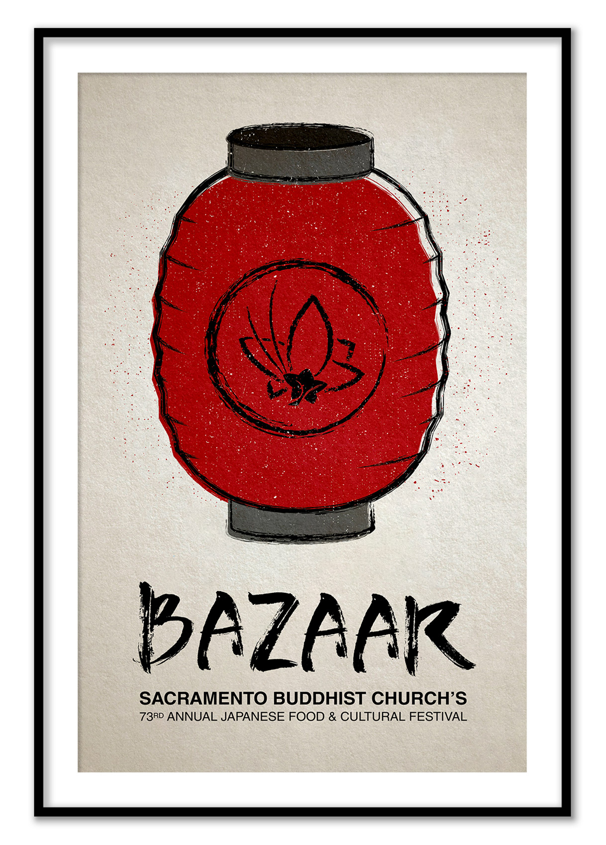
A festival icon
Color & Material
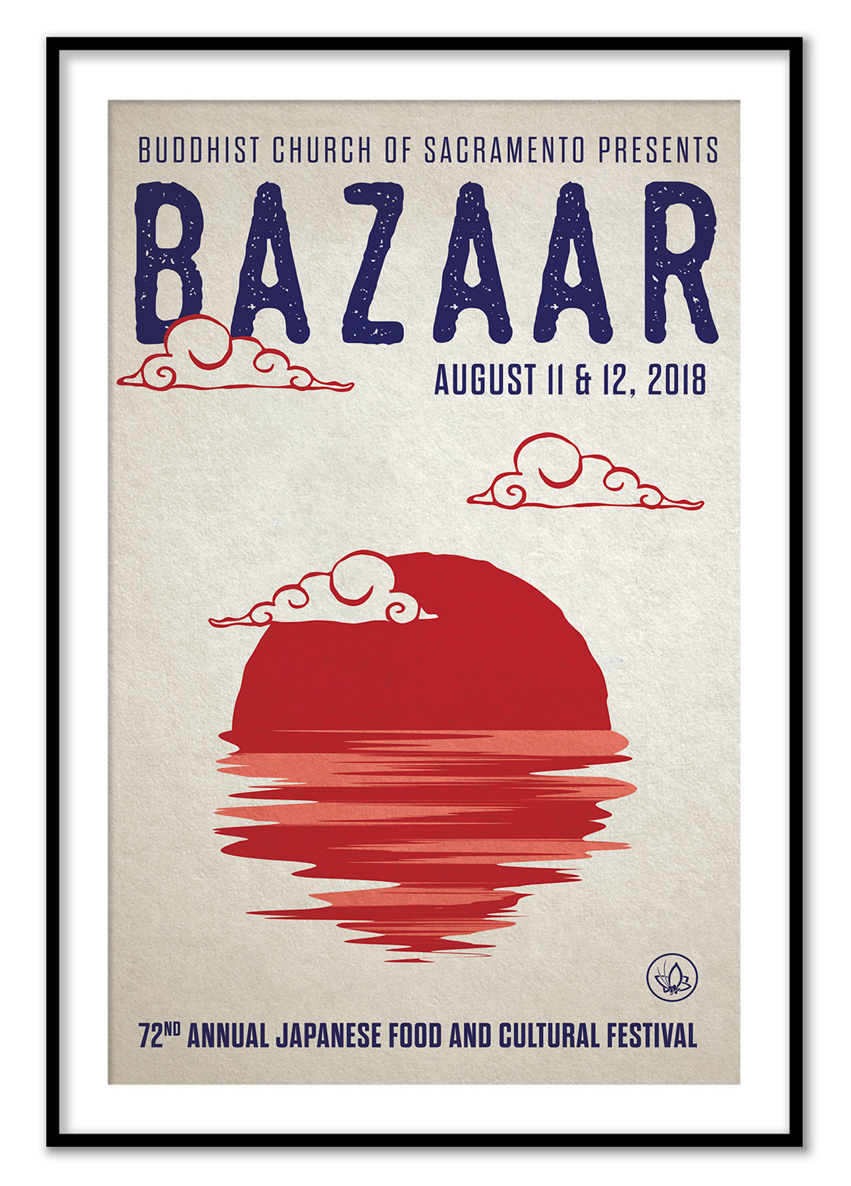
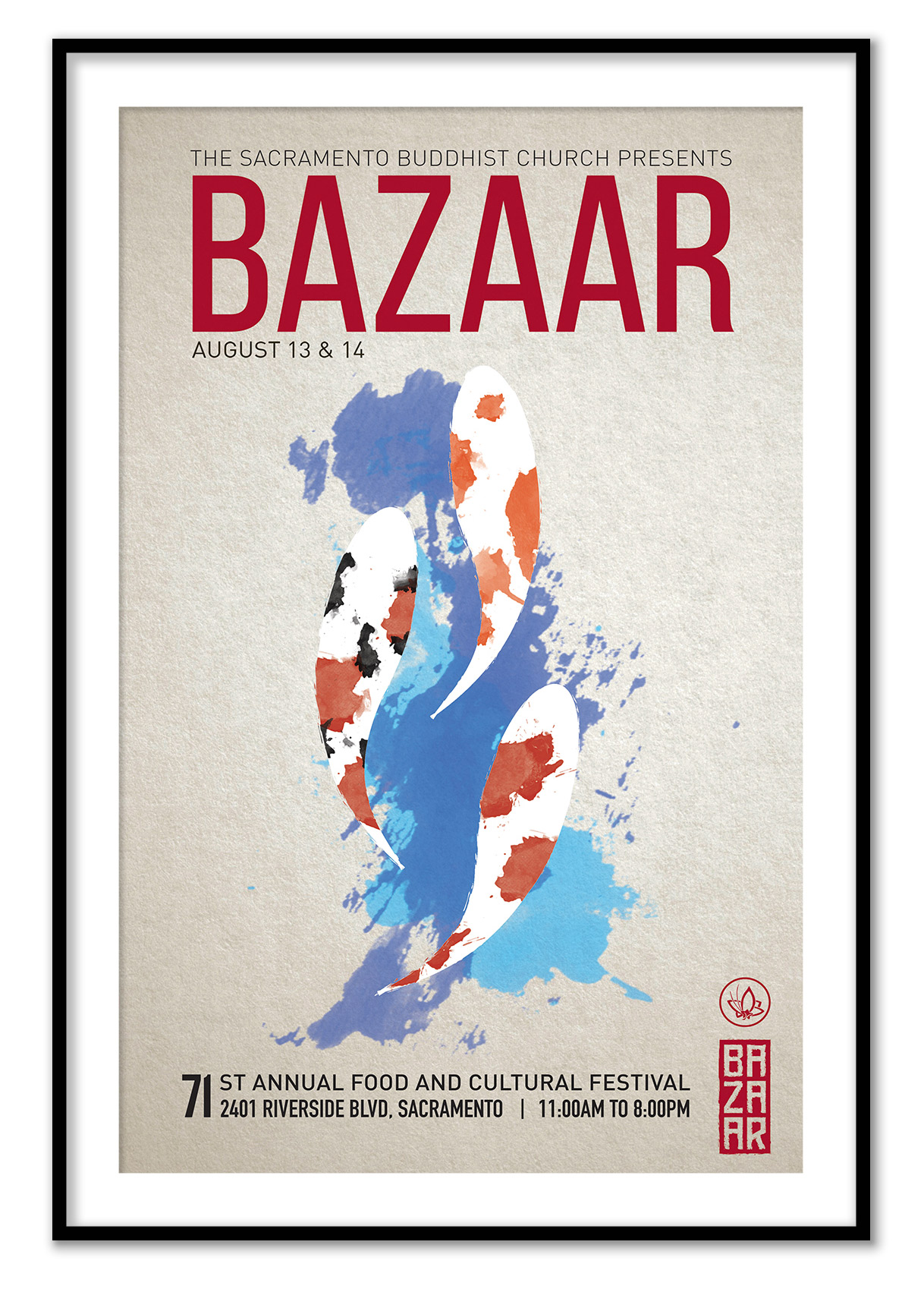
Red and blue are the unifying colors for this three poster series. Red in Japanese tradition reflects power and prosperity while blue was the color of the common people. Garments were often died with indigo, making fabric more resilient. Again, the textured paper provides a sense of commonality; subconsciously telling the posters’ audience that this festival is for everyone and anyone.
A fusion of syles
The goal of each poster was to bridge the wide gap of the festival’s vast audience. The festival’s history is rooted in 1st and 2nd generation Japanese Americans, but as they get older, it is up to the generations of the future to continue to support this festival. Honoring the Bazaar’s history while also attracting a younger audience called for blending graphic styles that would appeal to both audiences. Each poster draws from early Japanese graphic design history and different levels of abstraction.